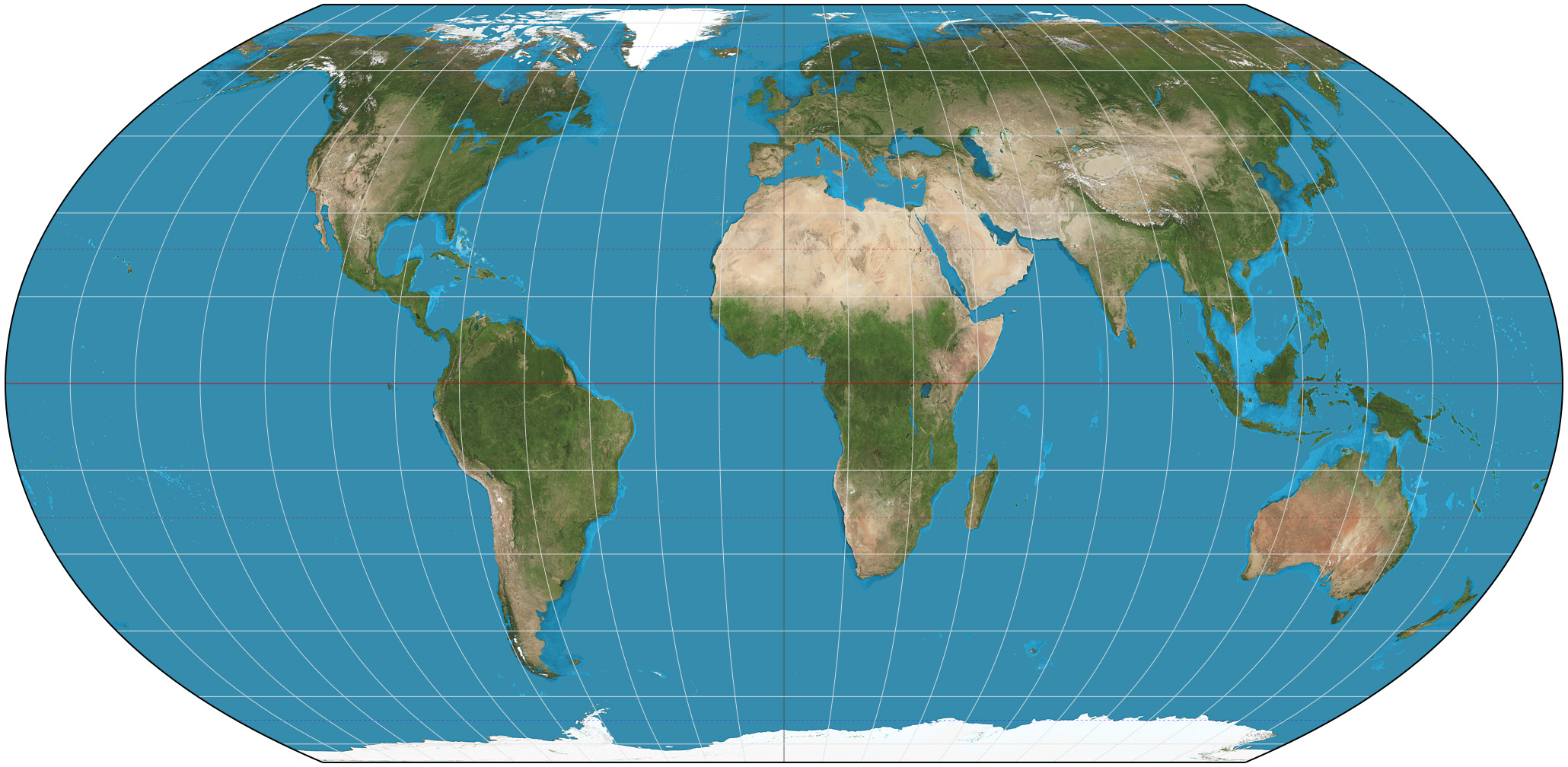
Equal Earth projection. 15° graticule. Imagery is a derivative of NASA’s Blue Marble summer month composite with oceans lightened to enhance legibility and contrast. Image created with the Geocart map projection software. By Strebe – Own work, CC BY-SA 4.0, https://commons.wikimedia.org/w/index.php?curid=72769307
On 4 September 2026, the UN General Assembly adopted a resolution calling for wider use of equal-area map projections, which preserve the relative size of countries and continents. The resolution, led by Togo on behalf of African states, passed by 164 votes to one, with six abstentions. It particularly highlights the Equal Earth projection, developed by cartographers in 2018.
The change addresses first of all a mathematical problem. Think of it as peeling an orange, and trying to arrange the peels on a flat surface; there is no perfect way to represent the curved surface of the Earth on a flat sheet of paper or screen. Every projection must distort something.
Our familiar Mercator projection, created by Flemish cartographer Gerardus Mercator in 1569, was designed for navigation. It allows lines of constant compass bearing to appear as straight lines – an enormous advantage to sailors in the age of naval exploration and maritime commerce – but increasingly exaggerates the size of landmasses the further they lie from the Equator. The distortion can be striking. Greenland, for example, can appear roughly comparable in size to Africa on a Mercator map. In reality, Africa is about fourteen times larger.
Equal Earth makes a different compromise. Created by Bojan Šavrič, Tom Patterson and Bernhard Jenny, it preserves the relative area of landmasses but distorts the shapes of continents – though it attempts to keep their shapes sufficiently visually recognisable. It is not necessarily more accurate in every respect – no 2D projection can make a flat map perfectly accurate – but it gives a much better impression of how large different parts of the world actually are in relation to one another.
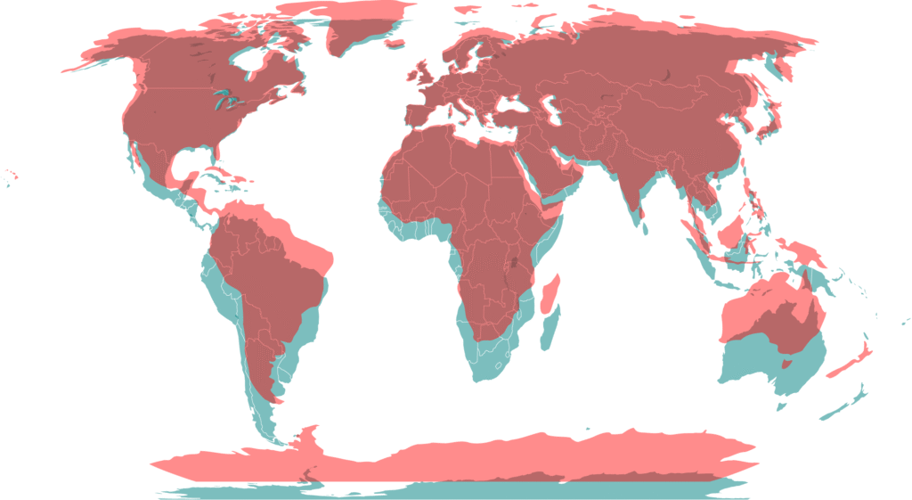
The UN resolution is, of course, non-binding, and it does not require every map to use one particular projection. Indeed, different projections remain appropriate for different purposes.
But this is why the General Assembly’s overwhelming vote in favour of a different approach to world maps is interesting. Maps look objective. And a familiar map in particular can easily feel self-evident: simply what the world looks like. But maps are representations. Every map of the Earth makes choices about which features of a complicated reality to preserve and which to sacrifice. Once we grow accustomed to one representation, its compromises become part of a somewhat distorted perception of the truth.
What is true of geography is true of many of the simplified representations we use to understand the world: the left-right political spectrum, GDP, historical periods such as ‘antiquity’ or ‘the Middle Ages’, political labels such as ‘liberal’ and ‘conservative’, or indeed even ‘continents’. Such categories are useful because they reduce an extraordinarily complicated reality to something our minds can grasp. They become divisive, limiting, and lead us astray when we forget that they are simplifications.
Changing the map therefore does not change the world. It replaces one simplification with a different one. But occasionally looking at something familiar from another perspective can remind us that what seemed like an immovable, self-evident truth may partly have been a familiarly distorted way of representing reality. And that the images through which we encounter the world, such as the size of Greenland relative to Africa, help shape the way we imagine it.